The Unbearable Cheapness of AI-Generated Art
As occasionally befalls internet culture writers, it was once again time for Charlie Warzel to write a piece about Alex Jones.
The top photo for articles about figures like Alex Jones tend to coagulate into a few familiar poses. Yelling at the camera; yelling at the InfoWars desk; yelling on the street—you get the idea. These quickly become repetitive, so Warzel asked the Midjourney AI art generator to produce a different spin on the classic Jones image, and used the result to introduce his article about Alex Jones' day in court. This made a bunch of people angry, because it appeared to validate fears that machine learning models are about to replace illustrators in publications like The Atlantic, which purchased Warzel's newsletter last year.
This is a reasonable fear.
The technology that allows you to type a simple idea and have an algorithm conjure it into existence is miraculous.
If businesses—particularly the notoriously stingy media businesses—can cut costs and keep the same level of quality, they will definitely do so.
But I am skeptical that Midjourney is going to replace a lot of work for illustrators, precisely because it cannot produce that level of quality on its own.
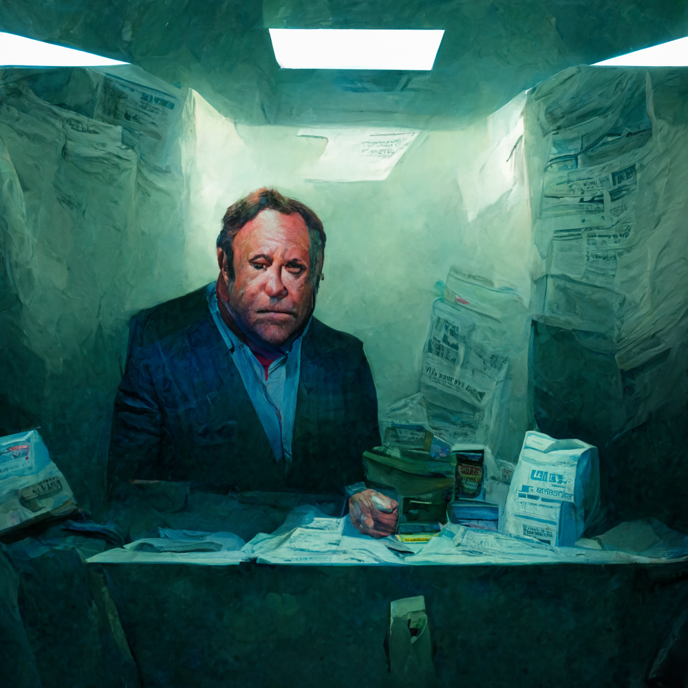
(AI art by Midjourney, text prompt by Charlie Warzel)
Consider the offending illustration of Alex Jones. It is vivid, morose, admittedly striking, and immediately recognizable as a product of contemporary AI technology: the eyes are all messed up; one of his eyelids is a skin flap; newspapers bleed into each other and into the severed thing that looks like a hand; all the text is the weird glyph language that lives inside these image models. While it doesn't look bad, really, it's not the kind of thing that would look good in the pages of The Atlantic. As Warzel explained in a follow-up blog, his newsletter has access to a Getty account, but no budget for an illustrator. It turns out that one of the things that distinguishes a newsletter from a magazine is money for art.
If you were being very generous, you could say that the Midjourney image of Alex Jones communicates something like "Alex Jones is slowly becoming the incoherent nonsense he's spent his life spreading." But you can't do that, because you know it's a lie. Even if the illustration were more convincing, the moment you identify it as a product of Midjourney, you feel differently about it. The infinite space where meaning could have existed collapses into a single phrase: "Alex Jones inside an American Office under fluorescent lights."
I'm not (just) making a judgement about the quality of Midjourney, Stable Diffusion, DALL-E et. al, or even a prediction about the likelihood that they will improve—I'm saying that a tool where you type a prompt and it creates an image is far too crude to produce art in all but vanishingly rare circumstances. DALL-E 2 is a crayon.
To pick on another newsletter author I respect, Casey Newton from Platformer has been making occasional use of DALL-E 2 to decorate his articles.
In a recent post about Elon Musk's Twitter lawsuit, Casey leads with an image generated by DALL-E that shows a Tesla driving off a cliff.
Look at the difference between Casey's DALL-E image and the header image from a Verge article he links to, about the exact same subject.
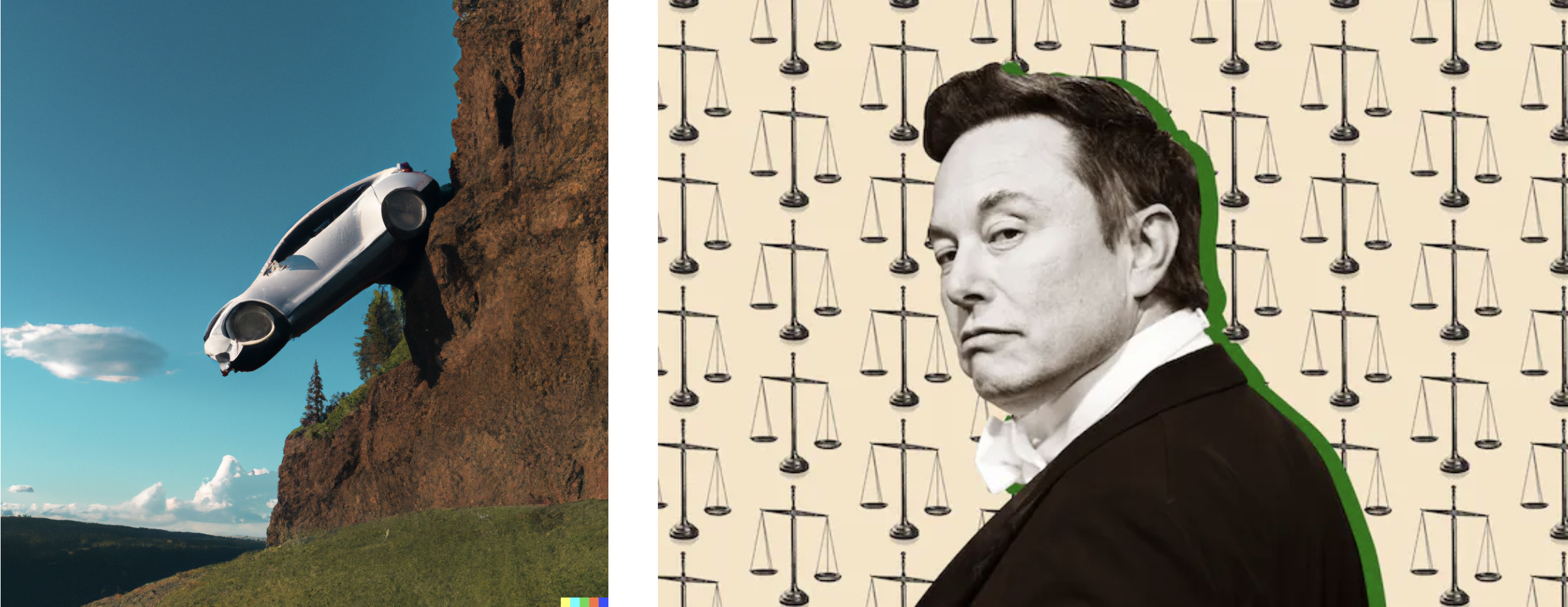
Especially in context, it's so obvious which of these was produced by a professional media company and which was whipped out by a machine learning model on the basis of a sentence fragment. The Tesla image is kind of funny, but it's mostly meant to fill space at the top of the article. Compare that with the image from The Verge (by Associate Creative Director Kristen Radtke), which is simple, effective, consistent with The Verge's visual identity, and instantly communicates what the article is about. A machine can't do that based on a sentence; an artist can.
And believe me, I asked:
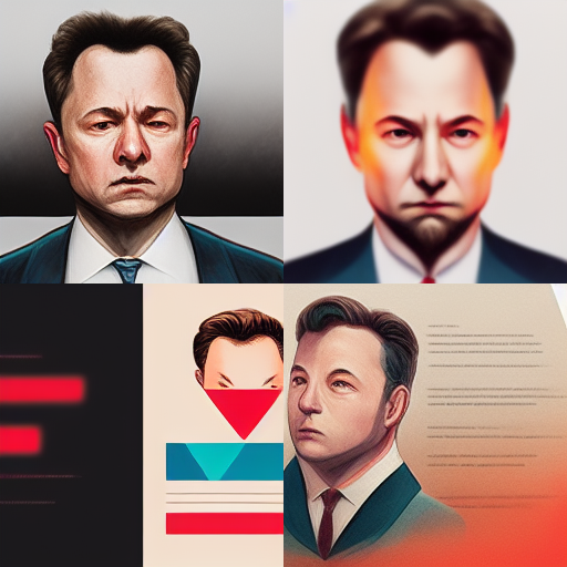
(AI art by Midjourney, text prompt by Alex Petros)
Our relationship with computers is already suffused with artificial intelligence, arguably nowhere more so than in visual art. Every digital camera—from an iPhone 11 to a Nikon Z 9—makes millions of tiny decisions about what it thinks the photo should look like when you shoot in program mode, and it makes almost as many decisions in manual mode. This definitely makes digital photography look different from film photography, but it has a surprisingly small effect on the qualities that make a great photo; program mode mostly helps more people take photos that are good enough. AI gives us a lot more levers to pull, but talent and skill are still required to operate them.
Did you read the story about Jason Allen, the guy who won a blue ribbon at the Colorado State Fair arts competition with AI-generated art?
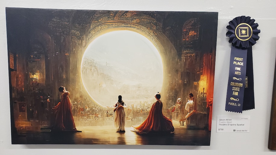
He started with a simple mental image — "a woman in a Victorian frilly dress, wearing a space helmet" — and kept fine-tuning the prompts, "using tests to really make an epic scene, like out of a dream." He said he spent 80 hours making more than 900 iterations of the art, adding words like "opulent" and "lavish" to fine tune its tone and feel. [...]
When he found images he really liked, he pulled them into Adobe Photoshop to remove visual artifacts. In one image, the central figure was missing a head, so he also painted in a crop of dark, wavy hair. He used another machine-learning tool, Gigapixel AI, to increase the photos’ quality and sharpness, then printed the three pieces on canvas — all variations on the French phrase for “space opera theater,” which he thought sounded cool — and drove to submit them to the state fair.
That's... a lot of work! Allen used Midjourney for inspiration and at least three tools total to produce the image he saw in his mind's eye. One of tools he used, Adobe Photoshop, has been a mainstay of digital art for decades. Photoshop uses mountains of machine learning to figure out what you're trying to do. To my knowledge, this is not particularly controversial within the digital art community, presumably because the AI-enabled tools inside Photoshop require effort and skill to produce a convincing image.
And to be honest, the result is cool, but it's cool in the way my desktop backgrounds were cool after I convinced my mom that having two 14-inch monitors was absolutely essential for completing my middle-school homework productively.
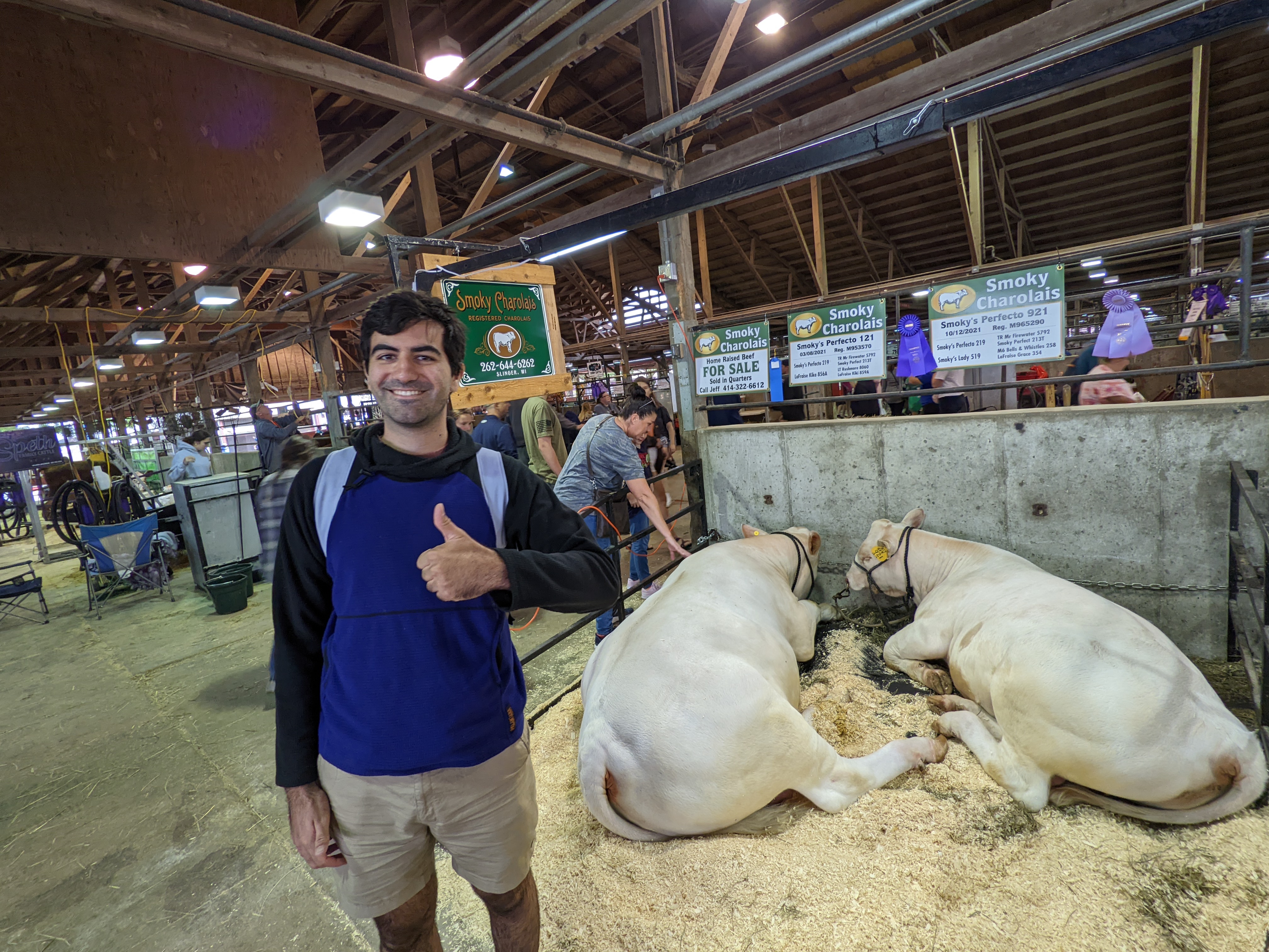
It's exactly the kind of thing a highly-motivated novice should be able to enter in a fair whose primary purpose is recognizing the best cow.
Art can only resonate with you precisely as much as you consider it, and the longer you spend considering any work of AI-generated art, the more the illusion shatters. Who made this? Why did they make it? What impact did it have? Art created by humans has answers to these questions, which is why museums have placards: the more you learn, the more likely it will mean something to you. The AI art generators might get better, but the stories never will.
It's important that we develop some social antibodies to the use of this technology. It remains crucial to credit artists, and in the process make it clear what was made by artists and what was made by machines. We need a technical and legal regime that makes it possible for artists to protect their work and prevent its appropriation to train these models. Some communities—like our digital Cassandras, the furries—have opted to ban them. I think that's good and reasonable. We should continue to demand artistic quality from our media companies, magazines, and creative enterprises, which necessarily requires that they employ artists.
But if you're writing a newsletter? It just looks cheap, and it cheapens your writing to include it. You might want to stick to Getty.
Thanks to Spencer Hamersmith for his feedback on a draft of this post.
Addendum to show I'm not a hater
Consider this Twitter thread, in which Twitter user @images_ai "fixes" famous paintings with AI:
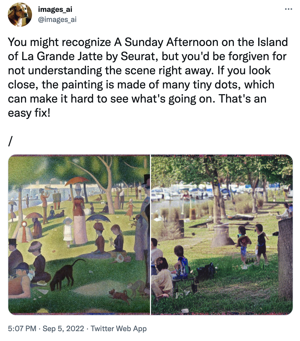
I think this is hysterical. I love the deadpan description of pointillism (which can make it hard to see what's going on!), the absurd idea that impressionism is something to be fixed, and the fact that the computer replaced a canoe with a pickup trick and turned the river into a sort of wet parking lot. It made me smile, it made me think, and I scrolled away from it with an ever-so-slightly different idea about what it means to exist in the world at this particular moment.
Artificial intelligence can wielded to produce art, but what makes it art has little to do with the machine and everything to do with the skill and humanity of the artist who wields it.