When the Down Arrow is not an Upside-Down Up Arrow
First posts are hard, so I'll start small. Here's two arrows:
⇧ ⇩
If you're on reading this on a relatively recent smartphone, chances are you see two reflected, but otherwise identical arrows.
One points up and the other points down.
On MacOS (Big Sur 11.6), however, the up arrow is much squatter than the one pointing down.
This is a photo of how it renders on my MacBook Pro:

Alex, those are two different arrows. Well yes, in the sense that one is up and the other is down, but they should be otherwise identical. I input two Unicode characters, "Upwards White Arrow" and "Downwards White Arrow", and I expected (reasonably, I think) that the down arrow would have the same proportions as the up arrow, only pointing down. So what's going on here?
Let's start with the basics. Unicode, if you've never never had to think about it before, is the international standard for representing text in computer software. When rendering text, your computer reads a series of Unicode "code points" and then turns those into the glyphs specified by your font. In Latin script, every character you type has a corresponding hexadecimal number—a code point—that gets saved in the computer's memory when you type it.
Because each character in the English alphabet is a single code point, representing English in Unicode is straightfoward.
The uppercase letter "C" is code point (U+0043, lowercase "r" is U+0072, and lowercase "o" is U+006F.
Other code points include the semicolon (U+003B), the lowercase letter "w" (U+0077), and the percent symbol (U+0025).
To display the text, the computer will read each code point and display whatever that sequence of code points should represent, in the chosen font.
When I write "Crow", what I'm really writing is:
U+0043)(U+0072)(U+006F)(U+0077)
That's why you can easily change the font on a webpage or a document—your computer has all this text saved as code points, it only has to render them differently. Other languages, where multiple code points might combine to create a single character, are far more complex, but operate under essentially the same principle: Unicode provides the code points, the computer translates that into text using a font.
Back to my messed-up arrows.
The ⇧ is the "Upwards White Arrow" code point (U+21E7) and the ⇩ is "Downwards White Arrow" (U+21E9).
If you're looking closely at those hexadecimals, you'll see they're two numbers apart.
In between them (U+21E8) is, you guessed it: ⇨, the "Rightwards White Arrow."
Well maybe Unicode specifices that these arrows should look different for some reason, and I'm using them wrong.
As with all open standards, you can simply go look up the definition.
The Unicode consortium has a webpage where you can search
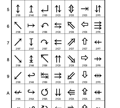
the whole standard by code point! Which is how I ended up with a PDF of Unicode characters 2190-21FF (8592-8703 in decimal), a subset of the standard appropriately titled Arrows:

That's a lot of arrows! But wait...
compututer, enhance!

Those are the arrows I want! They all look the same! If the Unicode standard suggests they should be the same, why don't my arrows do that? One StackOverflow answer for a different set of arrows posits that the Lucida Grande font (MacOS default) might render the arrows differently. This could have been the case for those arrows, but it would also be a weird thing for a font to do. All these arrows live right next to each other on the standard; there aren't a lot of good reasons to render one of a set differently.
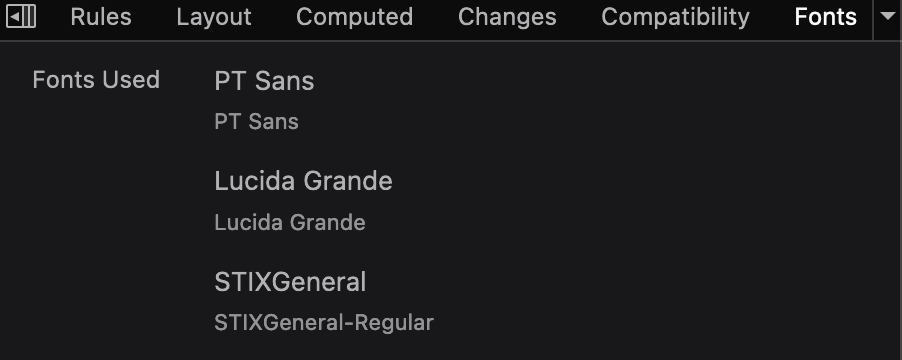
The answer is that the Lucida Grande font does not render the other arrows at all, it only renders the Upwards White Arrow. The other arrows are rendered in an entirely different font, a fallback font called STIXGeneral. You can see this by inspecting the following line in your browser's Dev Tools:
⇧⇩
Depending on your browser (I'm using Firefox) and OS, you might see something like this:

PT Sans is the font used on this website, but it doesn't have either of the arrows, so Firefox looks to my system font, Lucida Grande, and renders the Upwards White Arrow using it. Then, seeing that neither of those two fonts supports the Downwards White Arrow, it switches to a more comprehensive fallback font called STIXGeneral to display the character.
Why render just one of the arrows? According to Unicode CJK & Unihan group chair and Apple Font Developer Dr. Ken Lunde, some fonts implemented just the Upwards White Arrow because it is present in many Traditional Chinese fonts via a different, non-Unicode encoding called Big5. Lucida Grande presumably supported Big5 encoding, and the Upwards White Arrow glpyh was later mapped to its unicode representation, once the "Arrows" set came out. The creators of that font never actually specifically looked at the "Arrows" set and said "we'll support this, but only the up arrow;" they simply re-used the characters that they had ready to go, to support what they could.
There is a platform-independent solution though, one that renders properly no matter what fonts are installed, as long as they have the Upwards White Arrow. I used this little trick to mimic the Reddit upvote arrow recently. Try inspecting the element below:
⇧⇧
Have fun!
Enormous thanks to Twitter users @ken_lunde, @fake_unicode, and @litherum for finding my tweet and tagging various experts to help me explore the issue. If you read this post and would like to be credited by name and bio, let me know.
Update 1: Some commentors have pointed out that it's possible the Upwards White Arrow glyph originally represented the shift key, instead of CJK characters. If you were involved in the creation of the Lucida Grande font and know where it came from, contact me!
Further reading
- The Rust Programming Language has a very good explanation of how they model the complexities of UTF-8, and graphemes in particular: Storing UTF-8 Encoded Text with Strings
- This blog sent me down an absolute rabbit hole of stuff I did not know about strings: "The Absolute Minimum Every Software Developer Absolutely, Positively Must Know About Unicode and Character Sets (No Excuses!)"
- The aforementioned StackOverflow answer has the funniest gaslighting I've ever seen on StackOverflow, from a commenter who just says: "I think it is an optical illusion."